Step by step guide on how to build a React Ecommerce template using Tailwind CSS.
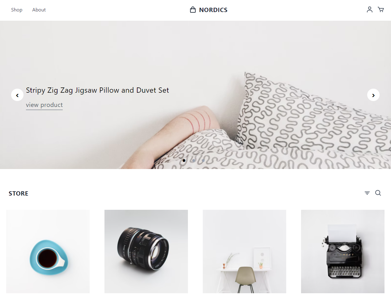
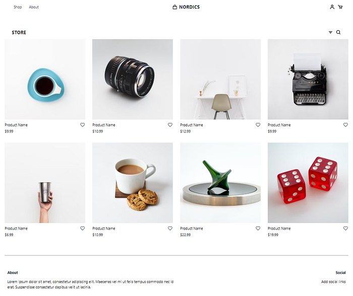
I am inspired by the e-commerce product listing Nordic Store template. This template uses Tailwind CSS and was created by Tailwind Toolbox
The Nordic Store template is a static Tailwind CSS template. So I planned to build a dynamic Nordic Store template with React.
In this blog series, we going to build an eCommerce dynamic template using React and Tailwind CSS.
Why use Tailwind CSS
Tailwind is a utility-first CSS framework for rapidly building custom user interfaces. Simply the utility classes help you to style web applications. So we can do all your styling with help of utility classes and without touch stylesheets.
Also, ready-made components are available on Tailwind UI.
Chapter 1: The Beginning
In this chapter, we going to do the below tasks:
- Create a new React app
- Installing Tailwind CSS and React Router
- Installing dependencies
- Creating basic layout component
- Creating home page
- Building Nordic Store static home page
Create a new React app
Create your new React app using create-react-app
Terminal
npx create-react-app tailwindcss-nordic-store
cd tailwindcss-nordic-store
Installing Tailwind CSS and React Router
The Tailwind CSS installation explained in the Tailwind CSS document here
First, install the tailwindcss, postcss, and autoprefixerand then run the init command to generate both tailwind.config.js and postcss.config.js.
Terminal
npm install -D tailwindcss postcss autoprefixer
npx tailwindcss init -p
Open tailwind.config.js file and add all paths of your template files.
tailwind.config.js
module.exports = {
  content: [
    "./src/**/*.{js,jsx,ts,tsx}",
  ],
  theme: {
    extend: {},
  },
  plugins: [],
}
Add the @tailwind directives for each of Tailwind’s layers to your src/index.css file.
src/index.css
@tailwind base;
@tailwind components;
@tailwind utilities;
We successfully installed Tailwind CSS on your app. For dynamic templates we need different pages, so we going to install React Router to your app.
Terminal
npm install react-router-dom@6
Installing dependencies
The Headless UI to power all of the interactive behavior and Heroicons for icons, so you’ll need to add these two libraries to your app.
Terminal
npm install @headlessui/react @heroicons/react
Creating basic layout component
The basic layout creation steps are posted in my earlier blog Create Your Own Layout Component in React.Create Your Own Layout Component in ReactA guide on how to create basic layout components with Header, Footer, and content section.javascript.plainenglish.io
Download the app and copy the components folder to your https://github.com/balajidharma/react-basic-layout/archive/refs/heads/master.zip
Update your App.js and include our Layout in your index.js:
src/App.js
import './App.css';function App() {
  return (
    <div className="App">
      Hello world!
    </div>
  );
}export default App;
src/index.js
import React from 'react';
import ReactDOM from 'react-dom';
import './index.css';
import App from './App';
import Layout from './components/Layout/Layout';ReactDOM.render(
  <Layout>
    <App />
  </Layout>,
  document.getElementById('root')
);
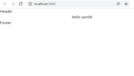
Now start your app and see the basic Header, Footer, and Content section of the browser.
Terminal
npm start
Browser
Creating Home Page
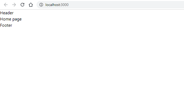
Time to create our page using React Router. Create a new pages folder under the src folder. Create Home component inside the pages folder
src/pages/Home.js
import React from 'react';class Home extends React.Component {
  render() {
    return (
      <div>
        Home page
      </div>
    );
  }
}export default Home;
React class component used for our app. Read more about React component here.
Include React Router and Home page as a index.js file. Also, we going to remove app.js.
src/index.js
import React from 'react';
import ReactDOM from 'react-dom';
import { BrowserRouter, Routes, Route } from "react-router-dom";
import './index.css';
import Layout from './components/Layout/Layout';
import Home from './pages/Home';ReactDOM.render(
  <BrowserRouter>
    <Layout>
      <Routes>
        <Route path="/" element={<Home/>} />
      </Routes>
    </Layout>
  </BrowserRouter>,
  document.getElementById('root')
);
Building Nordic Store static home page
We almost completed the basic setup. We split the Nordic Store template into Header, Footer, and Home sections in your app.
src/components/Layout/Header/Header.js
import React from "react";
class Header extends React.Component {
  render() {
    return (
      <header>
        <nav id="header" className="w-full z-30 top-0 py-1">
          <div className="w-full container mx-auto flex flex-wrap items-center justify-between mt-0 px-6 py-3"><label htmlFor="menu-toggle" className="cursor-pointer md:hidden block">
              <svg className="fill-current text-gray-900" xmlns="http://www.w3.org/2000/svg" width="20" height="20" viewBox="0 0 20 20">
                <title>menu</title>
                <path d="M0 3h20v2H0V3zm0 6h20v2H0V9zm0 6h20v2H0v-2z"></path>
              </svg>
            </label>
            <input className="hidden" type="checkbox" id="menu-toggle" /><div className="hidden md:flex md:items-center md:w-auto w-full order-3 md:order-1" id="menu">
              <nav>
                <ul className="md:flex items-center justify-between text-base text-gray-700 pt-4 md:pt-0">
                  <li><a className="inline-block no-underline hover:text-black hover:underline py-2 px-4" href="#">Shop</a></li>
                  <li><a className="inline-block no-underline hover:text-black hover:underline py-2 px-4" href="#">About</a></li>
                </ul>
              </nav>
            </div><div className="order-1 md:order-2">
              <a className="flex items-center tracking-wide no-underline hover:no-underline font-bold text-gray-800 text-xl " href="#">
                <svg className="fill-current text-gray-800 mr-2" xmlns="http://www.w3.org/2000/svg" width="24" height="24" viewBox="0 0 24 24">
                  <path d="M5,22h14c1.103,0,2-0.897,2-2V9c0-0.553-0.447-1-1-1h-3V7c0-2.757-2.243-5-5-5S7,4.243,7,7v1H4C3.447,8,3,8.447,3,9v11 C3,21.103,3.897,22,5,22z M9,7c0-1.654,1.346-3,3-3s3,1.346,3,3v1H9V7z M5,10h2v2h2v-2h6v2h2v-2h2l0.002,10H5V10z" />
                </svg>
                NORDICS
              </a>
            </div><div className="order-2 md:order-3 flex items-center" id="nav-content"><a className="inline-block no-underline hover:text-black" href="#">
                <svg className="fill-current hover:text-black" xmlns="http://www.w3.org/2000/svg" width="24" height="24" viewBox="0 0 24 24">
                  <circle fill="none" cx="12" cy="7" r="3" />
                  <path d="M12 2C9.243 2 7 4.243 7 7s2.243 5 5 5 5-2.243 5-5S14.757 2 12 2zM12 10c-1.654 0-3-1.346-3-3s1.346-3 3-3 3 1.346 3 3S13.654 10 12 10zM21 21v-1c0-3.859-3.141-7-7-7h-4c-3.86 0-7 3.141-7 7v1h2v-1c0-2.757 2.243-5 5-5h4c2.757 0 5 2.243 5 5v1H21z" />
                </svg>
              </a><a className="pl-3 inline-block no-underline hover:text-black" href="#">
                <svg className="fill-current hover:text-black" xmlns="http://www.w3.org/2000/svg" width="24" height="24" viewBox="0 0 24 24">
                  <path d="M21,7H7.462L5.91,3.586C5.748,3.229,5.392,3,5,3H2v2h2.356L9.09,15.414C9.252,15.771,9.608,16,10,16h8 c0.4,0,0.762-0.238,0.919-0.606l3-7c0.133-0.309,0.101-0.663-0.084-0.944C21.649,7.169,21.336,7,21,7z M17.341,14h-6.697L8.371,9 h11.112L17.341,14z" />
                  <circle cx="10.5" cy="18.5" r="1.5" />
                  <circle cx="17.5" cy="18.5" r="1.5" />
                </svg>
              </a></div>
          </div>
        </nav>
      </header>
    );
  }
}
export default Header;
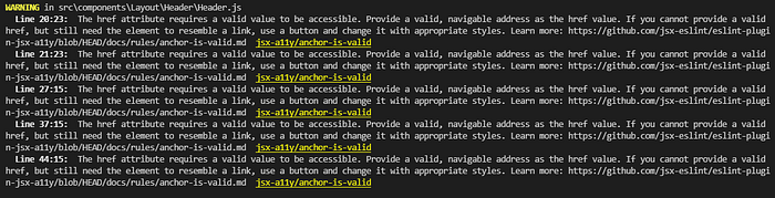
Make sure while coping change the class to className and for to htmlFor. Also, ignore the valid href warnings:
src/components/Layout/Footer/Footer.js
import React from "react";
class Footer extends React.Component {
  render() {
    return (
      <footer className="container mx-auto bg-white py-8 border-t border-gray-400">
        <div className="container flex px-3 py-8 ">
          <div className="w-full mx-auto flex flex-wrap">
            <div className="flex w-full lg:w-1/2 ">
              <div className="px-3 md:px-0">
                <h3 className="font-bold text-gray-900">About</h3>
                <p className="py-4">
                  Lorem ipsum dolor sit amet, consectetur adipiscing elit. Maecenas vel mi ut felis tempus commodo nec id erat. Suspendisse consectetur dapibus velit ut lacinia.
                </p>
              </div>
            </div>
            <div className="flex w-full lg:w-1/2 lg:justify-end lg:text-right">
              <div className="px-3 md:px-0">
                <h3 className="font-bold text-gray-900">Social</h3>
                <ul className="list-reset items-center pt-3">
                  <li>
                    <a className="inline-block no-underline hover:text-black hover:underline py-1" href="#">Add social links</a>
                  </li>
                </ul>
              </div>
            </div>
          </div>
        </div>
      </footer>
    );
  }
}
export default Footer;
src/pages/Home.js
import React from 'react';const products = [
  {
    id: 1,
    name: 'Product Name',
    href: '#',
    price: '$9.99',
    imageSrc: 'https://images.unsplash.com/photo-1555982105-d25af4182e4e?ixlib=rb-1.2.1&ixid=eyJhcHBfaWQiOjEyMDd9&auto=format&fit=crop&w=400&h=400&q=80',
  },
  {
    id: 2,
    name: 'Product Name',
    href: '#',
    price: '$10.99',
    imageSrc: 'https://images.unsplash.com/photo-1508423134147-addf71308178?ixlib=rb-1.2.1&ixid=eyJhcHBfaWQiOjEyMDd9&auto=format&fit=crop&w=400&h=400&q=80',
  },
  {
    id: 3,
    name: 'Product Name',
    href: '#',
    price: '$12.99',
    imageSrc: 'https://images.unsplash.com/photo-1449247709967-d4461a6a6103?ixlib=rb-1.2.1&ixid=eyJhcHBfaWQiOjEyMDd9&auto=format&fit=crop&w=400&h=400&q=80',
  },
  {
    id: 4,
    name: 'Product Name',
    href: '#',
    price: '$9.99',
    imageSrc: 'https://images.unsplash.com/reserve/LJIZlzHgQ7WPSh5KVTCB_Typewriter.jpg?ixlib=rb-1.2.1&ixid=eyJhcHBfaWQiOjEyMDd9&auto=format&fit=crop&w=400&h=400&q=80',
  },
  {
    id: 5,
    name: 'Product Name',
    href: '#',
    price: '$6.99',
    imageSrc: 'https://images.unsplash.com/photo-1467949576168-6ce8e2df4e13?ixlib=rb-1.2.1&ixid=eyJhcHBfaWQiOjEyMDd9&auto=format&fit=crop&w=400&h=400&q=80',
  },
  {
    id: 6,
    name: 'Product Name',
    href: '#',
    price: '$10.99',
    imageSrc: 'https://images.unsplash.com/photo-1544787219-7f47ccb76574?ixlib=rb-1.2.1&ixid=eyJhcHBfaWQiOjEyMDd9&auto=format&fit=crop&w=400&h=400&q=80',
  },
  {
    id: 7,
    name: 'Product Name',
    href: '#',
    price: '$22.99',
    imageSrc: 'https://images.unsplash.com/photo-1550837368-6594235de85c?ixlib=rb-1.2.1&ixid=eyJhcHBfaWQiOjEyMDd9&auto=format&fit=crop&w=400&h=400&q=80',
  },
  {
    id: 8,
    name: 'Product Name',
    href: '#',
    price: '$19.99',
    imageSrc: 'https://images.unsplash.com/photo-1551431009-a802eeec77b1?ixlib=rb-1.2.1&auto=format&fit=crop&w=400&h=400&q=80',
  },
]class Home extends React.Component {
  render() {
    return (
      <div><section className="bg-white py-8"><div className="container mx-auto flex items-center flex-wrap pt-4 pb-12"><nav id="store" className="w-full z-30 top-0 px-6 py-1">
              <div className="w-full container mx-auto flex flex-wrap items-center justify-between mt-0 px-2 py-3"><a className="uppercase tracking-wide no-underline hover:no-underline font-bold text-gray-800 text-xl " href="#">
                  Store
                </a><div className="flex items-center" id="store-nav-content"><a className="pl-3 inline-block no-underline hover:text-black" href="#">
                    <svg className="fill-current hover:text-black" xmlns="http://www.w3.org/2000/svg" width="24" height="24" viewBox="0 0 24 24">
                      <path d="M7 11H17V13H7zM4 7H20V9H4zM10 15H14V17H10z" />
                    </svg>
                  </a><a className="pl-3 inline-block no-underline hover:text-black" href="#">
                    <svg className="fill-current hover:text-black" xmlns="http://www.w3.org/2000/svg" width="24" height="24" viewBox="0 0 24 24">
                      <path d="M10,18c1.846,0,3.543-0.635,4.897-1.688l4.396,4.396l1.414-1.414l-4.396-4.396C17.365,13.543,18,11.846,18,10 c0-4.411-3.589-8-8-8s-8,3.589-8,8S5.589,18,10,18z M10,4c3.309,0,6,2.691,6,6s-2.691,6-6,6s-6-2.691-6-6S6.691,4,10,4z" />
                    </svg>
                  </a></div>
              </div>
            </nav><div className="grid grid-cols-1 gap-y-10 sm:grid-cols-2 gap-x-6 lg:grid-cols-3 xl:grid-cols-4 xl:gap-x-8">
              {products.map((product) => (
                <a key={product.id} href={product.href}>
                  <img className="hover:grow hover:shadow-lg" src={product.imageSrc} />
                  <div className="pt-3 flex items-center justify-between">
                    <p className="">{product.name}</p>
                    <svg className="h-6 w-6 fill-current text-gray-500 hover:text-black" xmlns="http://www.w3.org/2000/svg" viewBox="0 0 24 24">
                      <path d="M12,4.595c-1.104-1.006-2.512-1.558-3.996-1.558c-1.578,0-3.072,0.623-4.213,1.758c-2.353,2.363-2.352,6.059,0.002,8.412 l7.332,7.332c0.17,0.299,0.498,0.492,0.875,0.492c0.322,0,0.609-0.163,0.792-0.409l7.415-7.415 c2.354-2.354,2.354-6.049-0.002-8.416c-1.137-1.131-2.631-1.754-4.209-1.754C14.513,3.037,13.104,3.589,12,4.595z M18.791,6.205 c1.563,1.571,1.564,4.025,0.002,5.588L12,18.586l-6.793-6.793C3.645,10.23,3.646,7.776,5.205,6.209 c0.76-0.756,1.754-1.172,2.799-1.172s2.035,0.416,2.789,1.17l0.5,0.5c0.391,0.391,1.023,0.391,1.414,0l0.5-0.5 C14.719,4.698,17.281,4.702,18.791,6.205z" />
                    </svg>
                  </div>
                  <p className="pt-1 text-gray-900">{product.price}</p>
                </a>
              ))}
            </div></div></section></div>
    );
  }
}export default Home;
We created a home page without a carousel. We will implement the carousel in the upcoming chapter.
Add below style for mobile menu.
src/index.css
@tailwind base;
@tailwind components;
@tailwind utilities;#menu-toggle:checked + #menu {
  display: block;
}
The complete working code of this chapter is pushed and available on Github — https://github.com/balajidharma/tailwindcss-nordic-store/tree/Chapter_1.
That concludes our first chapter. Thank you for reading.
Stay tuned for more!
More content at plainenglish.io. Sign up for our free weekly newsletter. Get exclusive access to writing opportunities and advice in our community Discord.